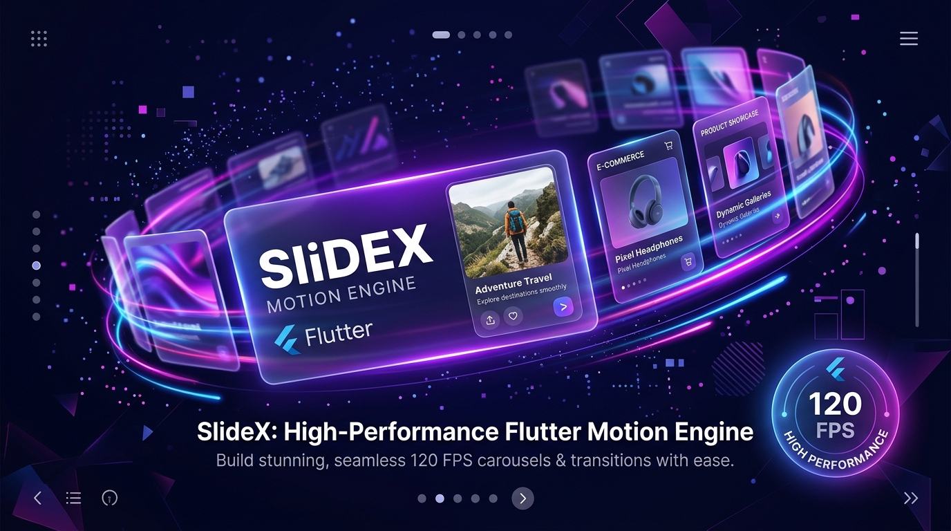
Next-Generation Motion & Carousel Engine
Combine Sliders, Swipers, Carousels, Tinder Card Stack, Instagram Story Viewer, Product Media Gallery, 360° Product Spinner, and 27+ 3D/2D Effects into one unified Flutter package.
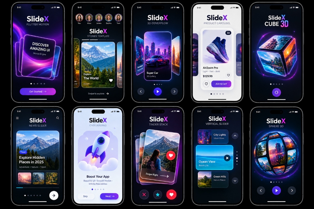
Everything You Need in One Package
Zero external dependencies. Pure Flutter canvas hardware-accelerated performance.
120 FPS Hardware Acceleration
GPU RepaintBoundary layer isolation and offstage pre-rendering ensure zero frame drops
during high-speed 3D matrix transforms.
Tinder-Style Card Swiper
Gesture drag velocity, rotation matrix tilt, green LIKE / red NOPE badges, and programmatic
SlideXCardSwiperController with rewind support.
App Onboarding Slider
Built-in 3D illustration cards, Skip, Next & Get Started CTA buttons with active glowing shadows and customizable typography.
Vertical Axis Carousel
Native vertical scroll axis, top/bottom arrow chevrons, and vertical indicator dots bar.
Instagram / Snapchat Story
Animated timer progress bars, tap right/left segment navigation, and long-press to pause state.
Product Gallery & 360° Spinner
Thumbnail strip navigation, full-screen lightbox zoom modal, and 360° interactive product rotation spinner.
27+ 2D & 3D Transitions
Coverflow 3D, Cube 3D, Sphere 3D, Wheel 3D, Cylinder 3D, Tunnel 3D, Helix 3D, Stack 3D, Parallax, Zoom, Scale, Blur, Liquid, Curtain, Morph, and Elastic.
Web & Desktop Interactive Controls
Native mouse wheel scrolling, trackpad gestures, keyboard arrow key navigation, and
pauseOnHover auto-play control.
10 Pre-Built Templates
Ready-to-use production UI templates built into the SlideX package.
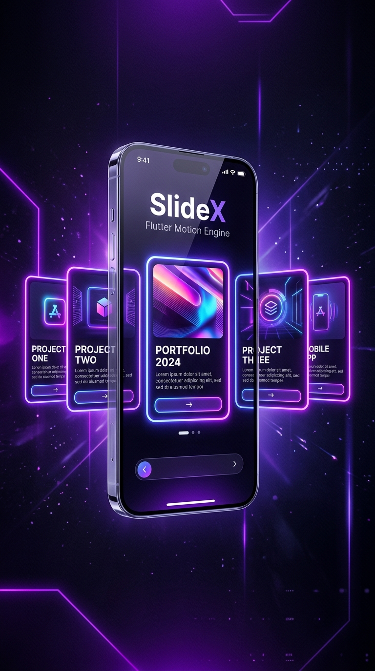
Template 01: CoverFlow 3D
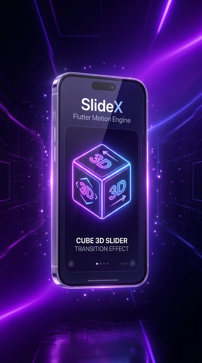
Template 02: Cube 3D
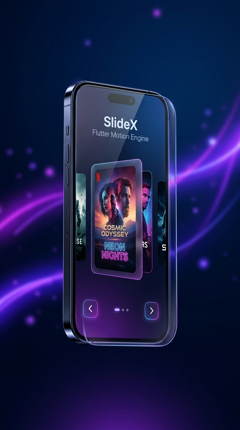
Template 03: Netflix Carousel
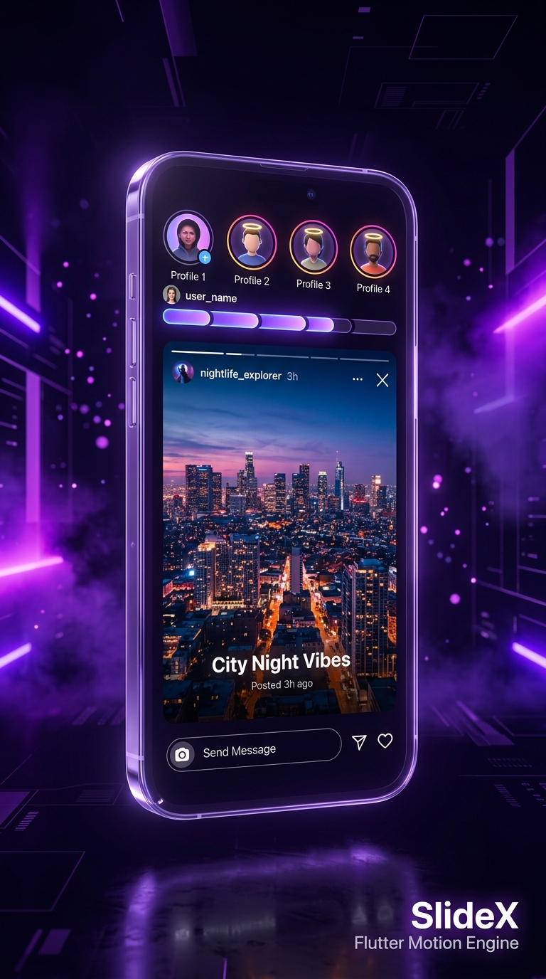
Template 04: Instagram Story
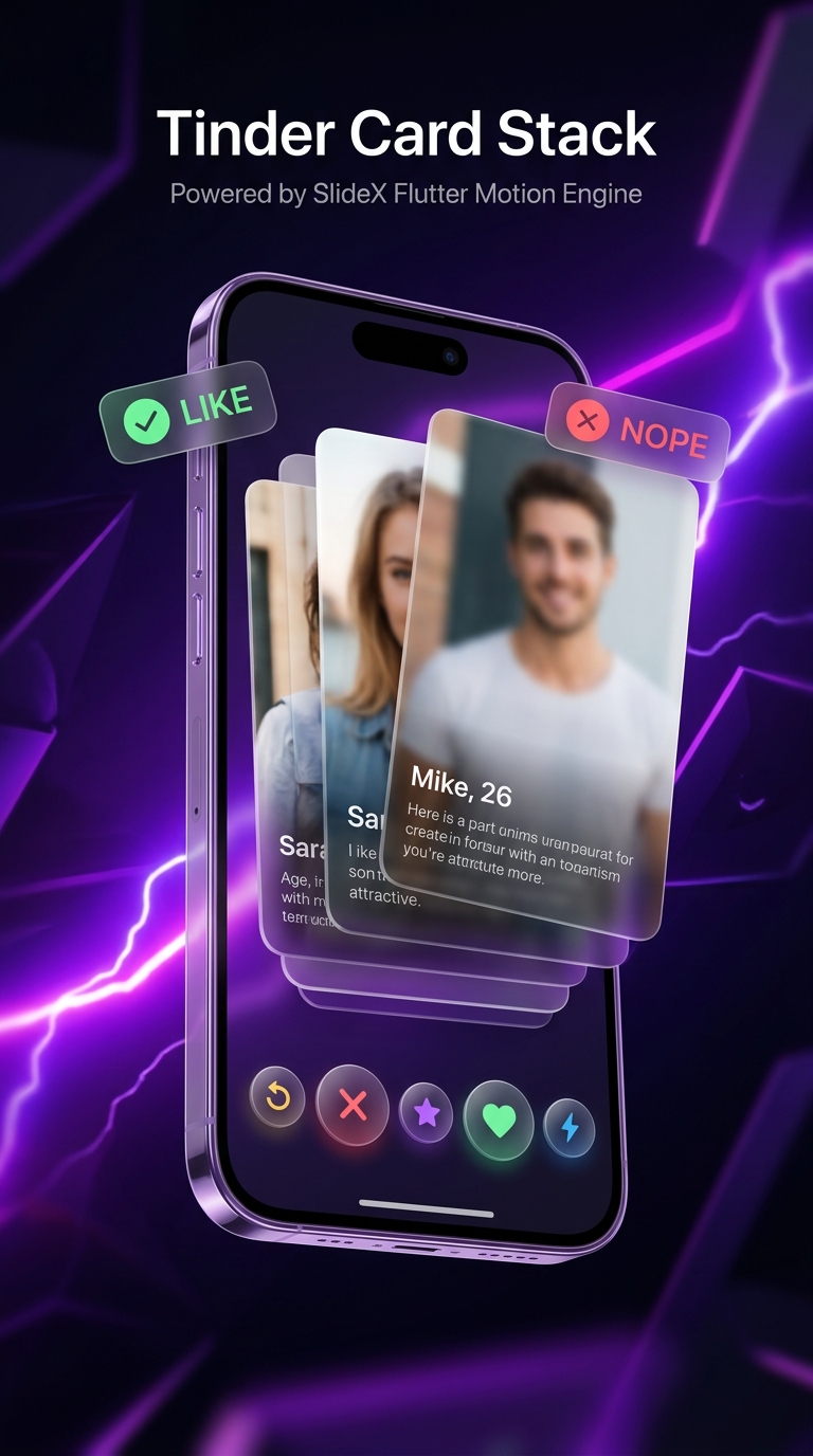
Template 05: Tinder Card Stack

Template 06: Product Gallery
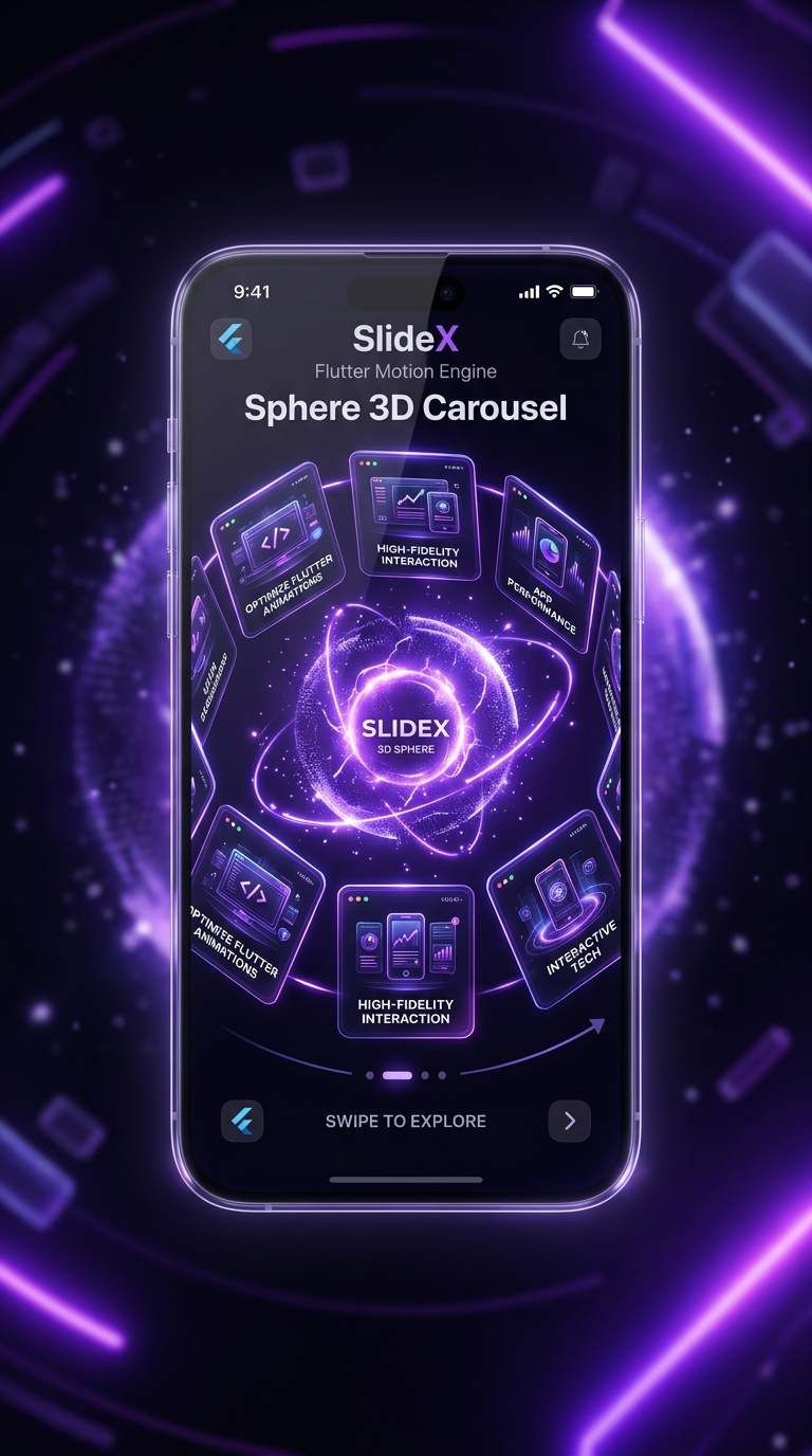
Template 07: Sphere 3D Orbit
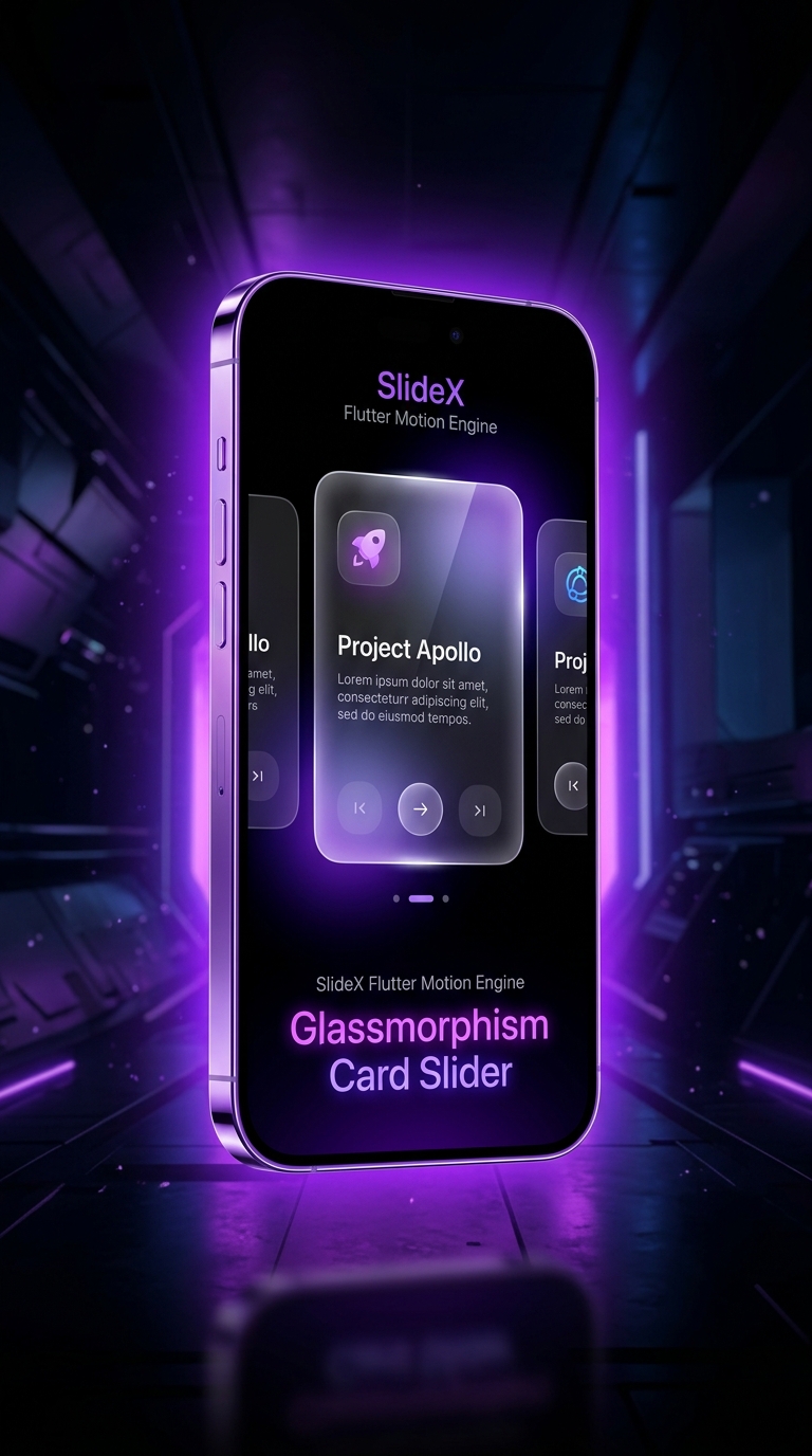
Template 08: Glassmorphism
Developer Documentation
Clean, copy-paste ready Flutter code examples for all SlideX constructors.
SlideX(
  effect: const CoverflowEffect(depth: 120.0, rotateAngle: 0.45),
  indicatorType: SlideXIndicatorType.expandingDot,
  indicatorActiveColor: const Color(0xFFEC4899),
  config: const SlideXConfig(
    autoPlay: true,
    viewportFraction: 0.85,
    pauseOnHover: true,
  ),
  items: [
    CardWidget1(),
    CardWidget2(),
    CardWidget3(),
  ],
)final controller = SlideXCardSwiperController();
SlideX.cardSwipe(
controller: controller,
likeBadgeText: 'LIKE',
nopeBadgeText: 'NOPE',
onSwipeLeft: (index) => print('Swiped NOPE on card $index'),
onSwipeRight: (index) => print('Swiped LIKE on card $index'),
cards: [
UserCard1(),
UserCard2(),
UserCard3(),
],
);
// Programmatic Control Actions:
// controller.swipeLeft();
// controller.swipeRight();
// controller.rewind();SlideXOnboarding(
activeColor: const Color(0xFF6366F1),
skipText: 'Skip',
nextText: 'Next →',
finishText: 'Get Started 🚀',
pages: const [
SlideXOnboardingItem(
image: Icon(Icons.rocket_launch, size: 100, color: Color(0xFF6366F1)),
title: 'Boost Your App',
description: 'Beautiful UI • Smooth Motion • Infinite Possibilities',
),
SlideXOnboardingItem(
image: Icon(Icons.bolt, size: 100, color: Color(0xFFEC4899)),
title: '120 FPS Motion Engine',
description: 'Tuned spring physics with zero drop frames',
),
],
onFinished: () => print('Onboarding Finished!'),
)SlideX.vertical(
height: 440,
viewportFraction: 0.85,
indicatorActiveColor: const Color(0xFF6366F1),
upControlColor: const Color(0xFF6366F1),
downControlColor: const Color(0xFFEC4899),
items: [
CityCard(),
OceanCard(),
ForestCard(),
],
)SlideX(
effect: const ZoomEffect(),
items: [
// Video Slide Item
SlideXItem.video(
VideoPlayerCoverWidget(),
title: 'Cosmic Voyage (4K Trailer)',
durationText: '02:45',
badgeText: 'VIDEO 4K',
onPlayTap: () => print('Play video'),
),
// Image Slide Item
SlideXItem.image(
const NetworkImage('https://images.unsplash.com/photo-1518709268805-4e9042af9f23'),
title: 'Neon Cyberpunk City',
subtitle: 'Sci-Fi • 6K Wallpaper',
badgeText: 'FEATURED',
),
// Custom Child Widget Slide Item
SlideXItem.child(
CustomPromoBanner(),
),
],
)API Reference Matrix
Full property and configuration options supported by SlideX.
| Property | Type / Default | Description |
|---|---|---|
scrollDirection |
SlideXAxis.horizontal |
Scroll orientation (horizontal or vertical) |
viewportFraction |
1.0 |
Viewport area occupied per slide item (0.0 to 1.0) |
autoPlay |
false |
Enable automatic page slideshow navigation |
autoPlayInterval |
Duration(seconds: 3) |
Time interval between auto-play slide switches |
pauseOnHover |
true |
Pause auto-play on desktop mouse hover |
loopMode |
SlideXLoopMode.infinite |
Infinite carousel wrap-around looping mode |
indicatorType |
expandingDot |
Indicator style (expandingDot, dot, number,
progressLine, none)
|
indicatorActiveColor |
Color(0xFF6366F1) |
Color of active indicator dot/progress bar |